The Hidden Cost of Web Visuals
- Posted on: 10 April 2025

When launching the Net Positive Centre for Health and Climate Solutions, we knew that our digital presence needed to reflect the values we stand for. As a centre dedicated to understanding and addressing the intersections between climate and human well-being, every decision we made—including the design of our website—had to be intentional, science-informed, and climate-conscious.
The internet is often perceived as “clean” because it’s virtual—but the reality is quite different. Websites consume energy every time they are loaded, refreshed, or interacted with, and that energy has a carbon cost. From the power used to run data centres, to the electricity needed to illuminate screens, the cumulative impact of our digital lives is growing. That’s why we committed to building a low-carbon website that aligns with the Centre’s mission.
The Hidden Environmental Cost of Colour
One of the most surprising elements we considered was colour. While aesthetically driven design usually focuses on branding and accessibility (both still vital), we learned that colour choices can also affect energy consumption, particularly on OLED screens used in smartphones and laptops.
OLED technology lights each pixel individually—so darker colours consume less power. By choosing a design palette that leans into muted, darker tones for key areas of the site, we’ve made small but meaningful changes that reduce the site’s overall energy use for users. Not only does this support sustainability, but it also improves battery life on mobile devices—an added benefit for our visitors.
For the design of our website, we turned to B Team, a creative agency known for their expertise in sustainable design. After thoroughly discussing our goals and values, B Team recommended a website approach that not only prioritises functionality and user experience but also minimises environmental impact. Their team worked closely with us to ensure that every decision, from the colour palette to image use, aligned with our commitment to both climate solutions and accessible digital experiences. Their innovative approach has helped us create a website that reflects our mission, while also leading by example in sustainable web development.
As a team committed to sustainability, we were excited to work with the Net Positive Centre for Health and Climate Solution on a project that truly aligns with our values. The challenge was finding the right balance between a visually engaging, user-friendly website and minimising its environmental impact. By carefully considering elements like colour, images, and performance, we were able to create a site that not only serves the Centre’s mission but also demonstrates that thoughtful design can be both impactful and sustainable.Ben Coleman, B Team
Rethinking the Role of Images
Images are often the heaviest elements on a webpage, dramatically increasing data load and energy use. While visual content is important for communication and engagement, we made a conscious decision to use images sparingly and strategically.
Where we do use images, we’ve:
- Optimised them using modern, lightweight formats (like WebP)
- Reduced unnecessary graphics
- Used SVGs for icons and logos to keep data size minimal
- Implemented lazy loading, so that images load only as needed
These decisions not only lower the carbon footprint of our site, but also improve page loading times—making our site more inclusive and accessible, especially for users on slower connections or in low-bandwidth areas.
A Website That Mirrors Our Mission
Our website design reflects our commitment to action—not just in the research we pioneer and policies we advocate, but in how we operate ourselves. By incorporating sustainable digital practices, we aim to model climate responsibility, and demonstrate that health and climate solutions must be reflected in both message and method.
Our website is just the beginning of the Net Positive Centre for Health and Climate Solutions’ journey. It’s designed to be functional, accessible, and aligned with our mission—showing that sustainability can be integrated into every aspect of our work, from the content we share to the way we present it online. By making conscious design decisions, we’re starting off on the right foot as we continue to focus on health and climate solutions that benefit both people and the planet.
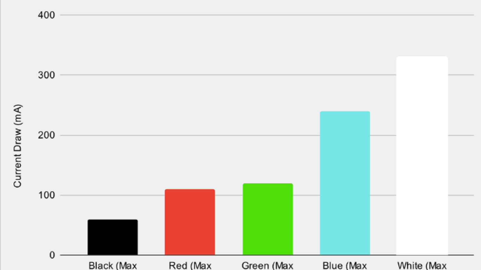
Colour diagram illustrating how much more energy white and light colours use vs darker shades